Saturday, April 24, 2010
One last hurrah!
For my final class project, I am creating a circus museum in Second Life using Special Collections objects including a number of photos and rare posters. Special Collections is located in Milner Library at Illinois State University. The Gamma Phi circus is going to perform on campus this April. Illinois State is one of two universities that has an 'in-house' circus training program, which is what Gamma Phi is. Florida State University is the other university that has a circus. I was doing some research for an NEH grant as part of my graduate assistant duties when I discovered this information. I was researching the history of ISU in order to discover when Art, Theater and Music history started to be taught. In order to do that I had to begin with the earliest course catalogs, which start almost with ISU's charter in 1857.
Physical education was introduced very early in the university curriculum and began with a YMCA facility in Bloomington/Normal. It was also considered important for women to "have a healthy complexion" fostered by 'appropriate' physical exercise. I believe this is clear indication of a specific sort of rhetoric aimed at the "fairer sex".
On campus, last week, I saw a poster that advertised the upcoming performance. The visual rhetoric of the image included a picture of a scantly clad female circus perform. Based on my review of hundreds of posters and photos from the ISU collection (mostly from the 1920's, 30's, and 40's) times have not changed much as far as what is used to 'sell' the circus.
I was not able to find an electronic version of the current poster. However, you can see an image from the past (or is it present?).
Wednesday, April 14, 2010
Metropolis - Cyborg Women in Film
I am reviewing the original script for Metropolis by both Fritz Lang and Thea von Harbou for a Visual Culture seminar discussion. I find it curious that Lang's final film includes a different representation of women's roles (vamp vs. virgin) than Harbou's does. I am not really surprised, but it is interesting to see how film as evolved, or not, as the case may be.
Harbou is certainly a product of her time, but her explanation for why Rotwang creates a female 'robot' is much clearer in her screenplay than it is in the movie where the Vamp 'bot is referred to as a Machine Man.
As I have been reading about Laura Mulvey's analysis of the gaze in film and Donna Haraway's Cyborg Manifesto, I have had a different experience when contemplating this visually compelling film.
Document Designs
Over the past few weeks I have been working on my ideas for a final project. As I consider how to proceed, I find that I think of my self as a "communication architect", which our author Schriver describes so well.
In this role I plan to create a virtual space in Second Life, that will really let me 'play' with this role. By creating a 3D-like space, I will be able to be a virtual communication architect. In this space I will be able to experiment with 2D document designs, typography, photoshop, and communication planning.
I have included an image of the planned space that I have created thus far. Let me know what you think.
Science and the Gaze
In Chicago, in 2006, I went to see Gunther von Hagen's Body Worlds. At the time, I was not aware of the controversy surrounding both his labor practices in China or the source of his 'specimens'.
I took my children to the exhibit to try to explain to them what had happened to both of their grandfathers, who had both died within the year. We were able to see examples of cancer in the body, which really helped them understand what happened in one instance. We were also able to see how Parkinson's disease affects healthy brain matter. One grandpa donated his body to a medical school so doctors could learn more about Parkinson's disease by looking at what happened to his brain (although he would not have wanted to be on permanent display). His body was returned after cremation. The other grandpa spent $10,000 on a funeral. This was money that he did not have. I was conflicted about these issues at the time.
People asked me why I took my children to this and how they felt about it. I explained that I wanted them to understand that death was not to be feared, but rather understood so that we could make the most out of the time we have to live. Furthermore, the kids were not afraid or disgusted probably because my husband and I weren't. Other patrons of the museum were respectful as well.
I realize there are cultural differences in the interpretation of Body Worlds. I also now know that there were serious ethical concerns. Some of the bodies on display may have been of executed Chinese political prisoners. Hagen's has addressed this, but not to universal satisfaction. Also, Hagen's factory was in China where the labor practices were questionable. When he tried to purchase a facility in Poland for plastination of human bodies, there was an uproar due to the history of Nazi death camps in the region.
Now, as the picture above infers, Hagen's is processing more animals for his exhibits, again the factory is in China. It should be interesting to see if he gets as much flack for this as he does for his human exhibitions.
Wednesday, March 31, 2010
Pictura, Inscriptio and Subscriptio
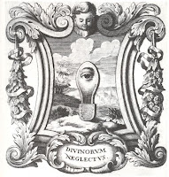
As a final note to my 'traveling' panorama, today I realized that I intuitively employed some of the theoretical strategies that Hanno Ehses and Ellen Lupton suggest in their joint article Design Papers: Rhetorical Handbook.
When I created the panorama, I used principles of the didactic emblem books of the sixteenth and seventeenth centuries (see Ottavio Scarlattini (1623-1699) image on this post for an example). Those principles were pictura, inscriptio, and subscriptio. Pictura refers to images; inscriptio, refers to titles or mottos; and, subscriptio refers to narrative text.
Ehses and Lupton say that, "The combination of image and narrative usually results in a riddle, the solution of which comes about through an explanatory third part, the narrative text. An emblematic image is not simply a mute representation but refers to didactic and moral meanings" (Ehses and Lupton 5-6).
While I realized that my rhetorical strategy for this module was not new, it was interesting to see that the intuitive process I used could be justified on another level than the way I justified it in my memo.
Ehses, Hanno and Lupton, Ellen. "Design Papers: Rhetorical Handbook." Cooper Union, NY. 1988. Call letters: P 93.5 . R54, 1988.
Tuesday, March 30, 2010
Uncle Tom's Pancake House
I pass by this sign every day and even though I am not a person of color, I find it offensive. The stock characterization of a group of people isn't right and I think signage like this perpetuates stereotypes.
I know I'm on a soapbox here, but really what's in a sign is more than mere letters. The visual rhetoric of this particular sign screams 'slur'.
Colonialism, Orientalism and Cultural Imperialism
I selected Slumdog Millionaire for (re)interpretation. I did this for three reasons. First, the representation of Indians by white, Englishmen disturbed me because the representations smack of residual colonialism. Second, the changes in the actor's skin color from the early part of the film to the end of the film serve to orientalize people of color. Third, there appeared to be several layers of cultural imperialism inherent in this film, including inter-India caste conflicts, Hindu and Muslim disputes, and perceived povertiy of India's populace by Westerners.
Now, that I have described my approach to viewing Slumdog I will proceed in defining the three primary concepts based on my understanding of colonialism, orientalism, and cultural imperialism.
Colonialism in this context refers to the domination of India under British colonial rule. In this film, the director, screenwriter, and producers are all white, Englishmen of means. Yet, they are appropriating Indian culture to stage this movie.
Orientalism in this context refers to the objectification of the primary female character, Latika (Freida Pinto). Rather than being soley a feminist perspective, this is infact orientalism on the level with Ingres in Grand Odalisque. Pinto fills the role of the 'other' as an object of the male gaze. Furthermore, Latika's oppressors are portrayed as violent men of color, which seems to be a pretty stable concept of Orientalism.
Cultural imperialism in this context refers to the domination of one religion over another. In this case it is Hindu versus Muslim. There appear to be Indian caste differences played out in the ethnic characteristics of the actors as well. Finally, the urban Indian slums depicted in this movie evoke cultural imperialism as well in regard to a Western gaze.
Friday, March 19, 2010
Blog Readings
Furthermore, Joe's comments about our class discussions and sharing of projects provided me insight to see how our work impacts each other in unanticipated ways. How much we choose to share, or not, creates a different kind of rhetorical response. Visual artists are quite familiar with the critique process, which is often not 'nice' in that context but can be very challenging indeed. I appreciate that we are able to defend our visual representations with a written justification. The critique process in our class is unique in my experience. Generally, like Joe, I like to see what my fellow students are doing and hear their points of view.
Monday, March 8, 2010
At the Human Zoo
Friday, March 5, 2010
How does PoMo make you feel?
Postmodernism would appear to be stitched into the fabric of our contemporary global existence. Just as the industrial revolution parted people from their rural paths and led them down the lane of urban alienation it would appear that the contemporary visible information 'superhighway' has continued to lead the masses to an invisible black-hole of consumption.
Who gains from this consumption? Does mass consumption and production of visual images contaminate visual pleasure in a psychological way? The constant fragmentation we experience between real and unreal seems to behave like a fracturing between wakefulness and sleep -- the phase where one has disarranged snippets of reality combined with the surreal. Maybe we are just copying and pasting ourselves into a new reality as JibJab or Second Life allows us to do.
I find that I am fragmented by Postmodernism as well. I used to feel secure in knowing fact from fiction in the visual realm. However, I no longer feel that confidence. Postmodernism has fractured my security. There is no one 'real' truth with Postmodernism. Sometimes that is liberating; sometimes that is terrifying. It depends on what I am looking at and when.
Wednesday, February 24, 2010
'Madness' and Creativity
In this week's readings, I have been covering some familiar territory. However, I still am trying to understand how Foucault's ideas impact a contemporary audience. For example, if the Panopticon Penitentiary never had a guard and prisoners still thought they were being observed is that a bad thing. There is a balance between self-surveillance and societal surveillance. In order to live free of anarchy, we do a 'deal' with the dominant class. How far are we willing to go? Of course, this is a complicated question with no definitive answer.
Just prior to the beginning of photography, Gericault, at the behest of a Doctor of psychiatry, completed a series of paintings depicting different 'types' of madness. (See image at the left)
As I was doing research on the color 'orange,' I found a contemporary psychiatrist that seems to assert that psychiatrists can identify mental illness by the kind of colors, brush strokes, and content a painter uses (Rao, AJP). It would seem that old habits die hard. While we think that some artists live closer to the edges of the Bell curve of behavior, I am not sure that that justifies a label of 'mental illness.'
Now, we have a whole array of 'medications' that are meant to aleviate mental illnesses. Are we 'aleviating' creativity as well? It seems that we endow the contemorary psychiatrist with a great deal of power to deter or determine in this instance.
Rao, Anjali and Matcheri S. Keshavan, "Can Psychaitrists Recognize Mental Illness in Paintings?" American Journal of Psychiatry 143, no. 4 (April 2006):599-600.
Monday, February 22, 2010
Group Colors
Chris and I both took a number of on-line color analysis tests. I likened the tests to a color horoscope. Some tests were meant to be general; some tests were meant to sell you something, and some were redundant. However, I thought some aspects of the tests were useful for providing a sense of introspection.
Chris's test results indicated that he has a 'purple' personality. When I looked at the 'purple' personality my source indicated that, "talent comes easily but 'purples' may lean too heavily on endowment and not enough on endurance. They have great philosophical powers and are tolerant" (Birren 41). He agreed with some aspects of the results and not others as did I. On the other hand, my test indicated that I have a 'white' personality. At first, I had negative associations with this because I think of the world in shades of gray not 'pure' white. However, I realized that in this context 'white' indicated a person who is primarily a 'peacemaker'. That is a pretty accurate assessment of my overall outlook. Chris and I found common ground in our color associations. I think we are different but that that contrast will work well together. We will be able to employ our different strengths and augment each others weaknesses. That sounds like something a 'peacemaker' would say ... hmmmm. Despite having been burned in past 'group' projects, I think this will be a productive association.
However, I don't think that these color tests are a reliable predictor of human behavior. Furthermore, I think the designers of the tests, in some instances, have an ulterior motive. For example, the Pratt and Lambert test site was created essentially to sell you paint. Additionally, there are cultural values that are associated with different colors that these sites do not address. For example, both purple and white are associated with death in cultures other than that of middle-America.
Work cited: Birren, Faber. Color in Your World. London:New York, Collier MacMillan Publishers. 1974. 41.
Wednesday, February 17, 2010
What do pictures have to say about color?
Memory needs color in order to be vivid (Mirzoeff 83). Nan Goldin, a photographer, said that she was relying on her photographs of her family and friends to keep her memory of them alive. Goldin's skill as a photographer lies in part in finding the intense colors in everyday lives that might otherwise be depicted in the grainy black-and-white style favored by most other documentary photographers (Mirzoeff 83).
This photo Vivienne in the green dress, New York, 1980, places Goldin's places her subject against a green wall, finding color contrasts in a red watch and blue radio to provide a lesson in the effects of complementary color (Mirzoeff 83).
While this example is not directly related to Horton's article on color for the web, I think it is instructive. Goldin seems to adhere to Horton's eight uses of color in her photograph (Horton 167). Perhaps, Horton's advice is applicable to more than web design.
Those eight uses of color are:
1. To direct attention
2. To speed search
3. To aid recognition
4. To show organization
5. To rate or quantify
6. To represent color itself
7. To attract and please users
8. To arouse an emotion
Works Cited: Mirzoeff, Nicholas. "The Age of Photography," In An Introduction to Visual Culture. London: Routledge, 1999. 65-90.
Horton, William K. "Color in Icons," In The Icon Book. 1994. 167.
Monday, February 15, 2010
What is wrong with this picture? The answer depends on when you asked. Until the 1950's stop signs were yellow and black. (source)
Yet, before that the answer was different. In 1915, the stop sign was black and white and not octagonal. In the 1920's, studies conducted by government safety commissions (Aikins 442) determined that black and yellow was a particularly strong color combination. {The natural world would seem to confirm this assessment, especially to anyone stung by a bumble bee or yellow jacket.}
As more research was conducted, red became 'the new yellow' at least for the color of the stop sign. Although people who have red/green blindness may be at a disadvantage, the color red remains a symbol of danger and power. The octagonal shape of the stop sign is meant to help alleviate this problem. Also, most electric traffic signals have red on top, then yellow, then green, to help people who are color blind as well.
What would a local road commissioner do if Stop Sign Red were to be co-opted by Coca Cola and the executives said they owned the color. It is difficult, but certainly not impossible, to imagine the legal chaos that would surround that issue. However, there seems to be plenty of litigation to go around. Pepsi has tried to co-opt a specific hue of blue (and so far failed) but D.A.P. (a company that makes caulking materials) has managed to get their red bucket legally branded. Why one and not the other? Well, maybe one company had lawyers that were better at rhetoric or perhaps one judge didn't like Pepsi products. I'm a Coca Cola gal myself. Either way the importance of color to corporate branding is big business.
Where does the 'little' guy fit into this picture? All this business is created to get us to buy into a brand or ideology of some sort. From the movie screen, to the small screen, to the closet rack we are bombarded by color decisions every day. I think about this every morning when I choose what to wear for the day. I used to love florals and patterns that reminded me of nature. Now that I have more responsibilities and less time to contemplate what to wear, I go for solids, usually black and one other color. I do this to streamline my decision making about the 'small' stuff. It makes doing laundry, shopping, and morning chaos go very smoothly so I can focus on the things that matter more to me like color theory. Is that ironic or what?
Work cited: Aikins, H. Austin. "Confusing Traffic Signals." Jstor, ISU Milner Library Download .pdf. April 1925: 442-444. (accessed 2/13/2010)
Wednesday, February 10, 2010
Corporate Color
After you have asked and answered these questions, you may choose to experiment with different hues, values, and intensities to achieve the affect you are seeking. For example, if you are trying to agitate an audience, you may wish to use the complementary colors of red and green. When placed next to each other, these two colors interact visually to create an almost vibrational quality. If, on the other hand, you want to created a sense of calm, an analogous color scheme is the blue/green range may prove effective.
The key to a successful application of color is thought, experimentation, and research. Research your target audience's likes, dislikes, and trends.
I found some information from another source that I thought was useful and would like to share.
COLOR TERMS THAT YOU NEED TO KNOW & UTILIZE
Every color available to us without any varition are called natural hues. Each of these natural hues can have a variation in tint, shade, or tone. The way that these variations come about are by combining natural hues with black, white, and all the grays in between. Even though many of you probably use the following terms on a regular basis, some of you might not know exactly what they mean or how they can help you in your website design.
HUE:
A hue is a pure color with no black or white added. A hue is the feature of a color that allows it to be identified as the color that it is, for example red, blue, yellow, green, purple, etc.
PURE HUE (NATURAL HUE):
A pure hue is the base color at its full intensity level, in other words, no shading, tinting, or tones have been added to the color yet.
SHADES:
Shades are the relative darkness of a color. You create a shade of a color by darkening the pure hue with black.
TINTS:
Tints are the relative lightness of a color. You create a tint of a color by lightening the pure hue with white.
INTENSITY (Also Known as SATURATION or CHROMATICITY)
Intensity describes the identifiable hue component of a color. A blue with RGB numbers Red - 0, Green - 255, and Blue - 0 (0,255,0) is considered 100% saturated and is intense, high in chromaticity, and completely saturated. A gray color has no hue and is considered achromatic with 0% saturation.
In the picture above, the colors are at 100% saturation
at the circle’s edges and get less intense (saturated) as
the colors get closer to the center of the circle.
TONE:
A tone is a hue that has had grey added to it. A tone can also be a hue with a large percentage of its complementary color added.
VALUE / LUMINANCE:
Basically, value is a a measurement of how close to black or white a given color is. In other words, value is a measurement of how much light is being reflected from a hue. Those hues with a high content of white have a higher luminance or value. If you look at the color wheel below, you will see that this whell is full of different color values. The outer band is the natural hue meaning that it is the original color. The 2nd band is a tint of the original hue and has a higher content of white or luminance than the original hue. The inner bands are shaded versions of the natural hue and are closer to black than the original hue.
AN EXAMPLE OF OUR COLOR THEORY PUT INTO USE:
Saturday, February 6, 2010
Inspiration by candlelight
Typography Video Link
As I was trying to decide what poem or song to re-design with expressive typographic principles, I read, with fresh eyes, some of my favorite poems.
One about Goya's (Goya - b. March 30, 1746, Fuendetodos, Spain--d. April 16, 1828, Bordeaux, Fr.) candle hat, is a favorite of mine. The unusual hat was an invention of Goya's that consisted of a hat with a special brim that had candle holders attached to it. He placed lit candles on the hat's brim so he could see to paint after dark.
Today, I began looking for typographic sources of inspiration and came across a video. I was not able to embed the video in this format, but you can link to the video above. I think it is worth your time. It was an illuminating experience. {Gratuitous groans are expected.}
Candlelight gutters and provides contrast to a room in a way no steady electric light can. In this way candlelight is like typography, "the idea behind contrast is to avoid elements on the page that are merely similar.... Contrast is often the most important visual attraction on a page-it's what makes a reader look at the page in the first place" (Course Source material ISU Eng. 350).
Candlelight flickers in a repetitive way that can be almost hypnotic; thus, providing a meditative state to a engaged participant. With type you can "repeat visual elements of the design throughout the piece. You can repeat colors, shapes, textures, spatial relationships, line thicknesses, fonts, sizes, graphic concepts, etc. This develops the organization and strengthens the unity" much as Goya did in figurative paintings (Course Source material ISU Eng. 350).
Candlelight enabled Goya to see more clearly. "Nothing should be placed on the page arbitrarily. every element should have some visual connection with another element on the page" (Course Source material ISU Eng. 350). In type, this is the principle of alignment; for Goya, it was careful use of space.
Candlelight is composed of flame, wick, and wax. Goya used this light to create a composition on canvas. In type, "items relating to each other should be grouped close together. When several items are in close proximity to each other, they become one visual unit rather than several separate units. This helps organize information, reduces clutter, and gives the reader a clear structure"(Course Source material ISU Eng. 350).
It would seem that painters and typographers share a similar goal --the attempt to arrest a viewer's attention. An artist tries to get someone within proximity to align with their work in order to create a contrasting view that will repeat in the viewer's mind.
Sunday, January 31, 2010
Typefaces are manufactured images designed for infinite repetition (Lupton 13). However, that does not mean that typefaces and fonts don't have personality.
Renaissance artists sought standards of proportion in the idealized human form (Lupton 17). This idea has both persisted and perhaps paradoxically transformed typeface, font families and typology. This image, taken from the Comical Hotch-Potch or Alphabet turn'd Posture-Master, a hand colored print published in London in 1782 by Carington Bowles, shows a whimsical view of 'the idealized human form'. In this case, the print may have been developed to educate children as cavorting, jovial characters provide an instructive view of the alphabet with posture and rhyme (Colonial Williamsburg Foundation publication).
Perhaps it is in the humanist tradition to anthropomorphize type. Typeface can be used as a way to express the personality of the text content, authorial context, and designer influence while attracting and maintaining attention. A 'one-size-fits-all' approach to typeface is neither universally appropriate nor necessary. However, like people, some typefaces work in more domains than others. We shouldn't squander the coveted commodity of someones attention by not paying attention to the details (Lupton 75).
One would be well served to take a Who, What, Where and When approach to typeface. The role of typeface is critical to mood, personality, and tone as these attributes emphasize the importance of a document's genre, purpose and context. (Brumberger).
Citations:
Brumberger, Eva. R. "The Rhetoric of Typography: The Awareness and Impact of Typeface Appropriateness," in Technical Communication; May 2003; 50, 2; Humanities Module, p. 224.
Lupton, Ellen. Thinking With Type: A Critical Guide for Designers, Writers, Editors, and Students. New York, NY: Princeton Architectural Press,2004.
Colonial Williamsburg Foundation, "Comical Hotch-Potch: Print Reproduction." Worcester, MA: The Charles Overly Studio, 1991 copyright, printed 2007.
Thursday, January 28, 2010
Haitian Orphans 'Saved' by American Kids
Over the last few days I have been looking at the pictures of the Haitian earthquake aftermath and trying to absorb the horror of the situation. As I watched the local news last night, a local news segment interpellated my attention.
The 'feel-good' story of the day focused on a group of local school children. They had forgone the traditional gift exchange that is held near winter break for many American middle school kids. Instead, they chose to send a gift bag to Haitian orphans. The story was that the American children had 'saved' this group of orphaned Haitian children because they donated items to them and the Haitians received the gift the day of the earthquake. Hence, the Haitian kids were outdoors playing with their new objects when the earthquake struck.
I had conflicting emotions when I watched this 'feel-good' story. Initially, I thought, "How nice." As the story progressed, I became more conflicted. The Caucasian children 'saved the day' by shipping a few trinkets to these Haitian children. Now, the orphans are living in a chicken coop because it is the only orphanage building to survive. The American children are raising money to help the Haitian orphans. I suppose it is a step in a positive direction. However, the specter of colonialism lurks in the background. If the Haitian children had had decent structures to begin with, then the devastation might not have been as severe.
However loosely, the sense of faith in God and religious ideology seemed to be a common cultural tie that bound the two cultures together and was an undercurrent in the news report.
People try to make sense out of the world with whatever tools they have at their disposal. I think the news report was trying to denote an act of generosity, but connotes an act of superiority that troubles me.
Just in case you were wondering, I did donate to the Red Cross Haitian relief effort. I probably should have given more.
To view the original newscast go to: http://www.centralillinoisnewscenter.com/news/local/82844282.html
Sunday, January 24, 2010
Chapter Two - Viewers Make Meaning
According to Louis Althusser, what is interpellation (p. 50-51)?
"In Althusser's theory of ideology, interpellation is the mechanism that produces subjects in such as way that they recognize their own existence in terms of the dominant ideology of the society in which they live" (Macey 203). The French term interpellation can mean being taken in by the police for questioning (Macey 203).
"An individual walking down the street hears from an officer --'Hey, you there!' --and turns to recognize that in fact she is the one being addressed or hailed" (Macey 203).
Find an ad online and explain how you have been interpellated by it.
Fred Astaire appeared to dance on the ceiling in Royal Wedding in 1951. The cultural codes of America in the 1950's are encoded in this advertisement for wallpaper (shown above). The figure in the picture is a female, which in this instance connotes the domestic domain. The female figure is bare-foot and scantily, if elegantly, clad, which is again suggestive of 1950's American roles for women. The mirror reflects her cleavage and little else.
Is there a failproof method of controlling how an image is received by its audience(s)? What are some of the variables that affect how a viewer perceives and interprets an image?
No. However, that does not mean that image makers do not try. There are many variables that affect how a viewer perceives and interprets an image. First, a viewer brings personal experience and different kinds of training when viewing an image. Second, a viewer's gender or sexual orientation affects image viewing. Third, race, nationality, ethnicity, religious affiliation, and self-identity all affect how one perceives an image.
What is hegemony? How is it constructed in a given society?
According to Macey, the term hegemony "derives from the Greek hegemon, meaning leader, prominent power or dominant state or person, and is widely used to denote political dominance" (Macey 176). Gramsci' notion of hegemony distinguishes between the two superstructural levels of political society, or the state and its agencies, and civil society or the private realm (Macey 176). The state dominates primarily through direct coercion including, laws, military, etc.... Civil society dominates primarily through the realms of intellectual and economic production. An hegemonic conception of the world forms when the popular culture adopts the rationale of the ruling classes and that rationale permeates the whole of civil society.
Text Citation: Macey, David. Dictionary of Critical Theory, pg. 203 and 176. London, U.K.: Penguin Books, 2000.
Image Citation: Wacky wallpaper
Chapter One - What is truth or fiction?
How is Magritte’s painting an argument about the relationship of words and things?
Magritte admonishes us to beware of the "treachery of images" with his pipe that is not a pipe but rather an image of a pipe. In the image to the left, the egg is referred to as a tree, the shoe as a moon, the hat as snow, the candle as the ceiling, the glass as a storm, and the hammer as a desert. The title to this painting is "The Key of Dreams". If Magritte had not used words with his images, we would engage with this painting in a completely different way. As it is, I had to engage with the painting to translate the French words to English. What did I lose in translation?
What do the authors mean by the “myth of photographic truth?”
The general assumption is that whatever image is captured in the silver of the film becomes irrefutable truth. However, the camera is operated remotely or directly by a person. The person has the power of capturing the image as she sees fit. She can crop and frame what she likes and filter what she sees when she wants. One can equate this to a storyteller's art.
Digital cameras and image software like Photoshop have changed the nature of the photograph's perceived truth. Perhaps photography is more like painting now than in Barthes era. For example, I used Photoshop to remove the words that Magritte used on his painting (shown above right). I altered his painting and could do the same to a digital photograph.
What the difference between the denotative and connotative meanings of images (p. 20)?
"The denotative meaning of the image refers to its literal, explicit meaning. ... Connotative meanings are informed by the cultural and historical context of the image and its viewers' lived, felt knowledge of those circumstances --all that the image means to them personally and socially" (Sturken 20).
Arguably, I changed both denotative and connotative meaning of Magritte's painting by manipulating the image. Moreover, the connotation of the original painting is subject to change depending on the person looking at the painting.
Introduction to Visual Rhetoric
I think we privilege print for three primary reasons. First, it is a way to record complicated thoughts in a way to aid or influence collective memory. (I swiped this idea from Derrida.) Second, it can promote deeper understanding of those complicated thoughts because it takes time to absorb and process the written word. Finally, it is relatively durable and fairly inexpensive to produce and distribute thanks to the printing press.
On the other hand, the authors claim that “We are thus at a moment in history in which the visual matters more than ever” (p. 1). Do visuals matter more than they did in the past? If so, why?
I do not know that I agree that we are at a point in history where the “visual matters more than ever” (Sturken 1). The visual is perhaps more present than ever. However, the ubiquitous nature of the ‘visual’ does not make it matter more today than in the past. For example, following the Council of Trent (1545-63) and the Catholic Reformation the importance of the visual gained a renewed sense of purpose that was a reaction against the iconoclastic aspects of the Protestant Reformation. The power of the visual messages via painting, sculpture and architecture of the Catholic Church to the illiterate masses was meant to bring wayward sheep back into the fold. Those images are still very powerful to many for various reasons.
Therefore, I would assert that visuals do not matter more than they did in the past but are probably more widely available. I am not convinced that that makes them more ‘powerful.’ I suppose it depends on how you ‘look’ and that is determined by a myriad of factors including culture.
How is culture defined in the introduction? What does culture have to do with visual rhetoric?
Certainly, how one ‘looks’ is filtered by one’s culture. Sturken and Cartwright define culture in several ways. However, I will defer to their italicized form of culture in the anthropological sense. Culture is “ a whole way of life” (Sturken 3). In terms of visual culture, Sturken and Cartwright define it as the shared practices of a group, community, or society through which meanings are made out of the visual, aural, and textual world of representations and the ways that looking practices are engaged in symbolic and communicative activities (Sturken 3). How one ‘looks’ can certainly influence how one uses visual rhetoric.
Citation: Sturken, Marita and Lisa Cartwright. Practices of Looking: An Introduction to Visual Culture. Oxford, U.K.: Oxford University Press, Inc. 2009.
Image: Caravaggio, Entombment of Christ, 1602 now at the Vatican in Rome, Italy. http://www.artinthepicture.com/artists/Caravaggio/entombment.jpg
Wednesday, January 13, 2010
What is visual rhetoric anyway?
The simplest definition for visual rhetoric is how/why visual images communicate meaning. Visual rhetoric is not just about great design and aesthetics but also about how culture and meaning are reflected, communicated, and altered by images and text.
Visual literacy involves all the processes of knowing and responding to a visual image, as well as the all the thought that might go into constructing or manipulating an image.
Duke University has a couple of .pdf's to help you figure out how to think a bit more critically about what you experience as a visual consumer and producer.
Barbara Kruger is a queen of visual rhetoric. However, the billboard owner profits from both sides of this particular argument. Check out Art21 at http://www.pbs.org/art21/ for more information about Kruger's artwork.